Claude Dashboards + Motion: What They Do and Who Gets Them
By ToolPilot Pro · Updated 2026-10-11 · Productivity
#productivity#claude dashboards#claude motion#anthropic claude dashboards beta#claude motion mp4#claude dashboards vs chatgpt#claude design closing date#claude motion team enterprise#claude dashboards pricing
Claude Dashboards + Motion: What They Do and Who Gets Them
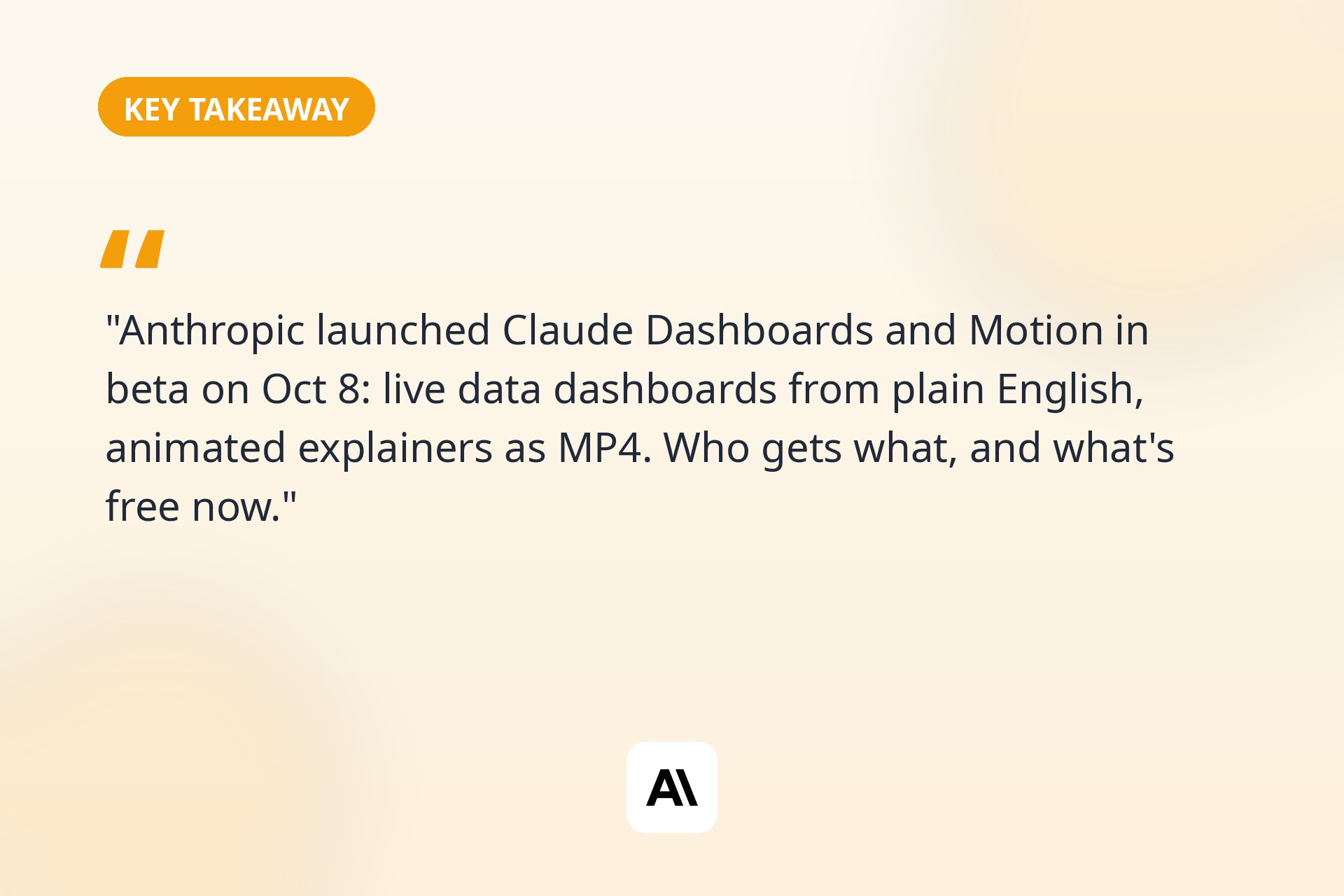
On October 8, 2026, Anthropic gave Claude two new jobs. The first is data analyst: connect your company's data, ask a question in plain English, and get a live dashboard back. The second is motion designer: describe an animation, get editable code that renders it, and export the result as an MP4.
They are called Claude Dashboards and Claude Motion. Both are in beta, both are gated by plan tier in ways that matter, and they landed in the same week OpenAI was making noise about GPT-6's Intelligent UI. That timing is not a coincidence. The AI assistants are in an arms race to stop being chat windows and start being workshops.
I spent the days since the announcement reading Anthropic's release notes, the Help Center docs, and the hands-on reports, and cross-checking what is actually live against what is marketing. Here is the honest version: what each tool does, who actually gets it, the tier split nobody puts in the headline, and what is worth trying first.
What Actually Launched on October 8
Let us get the logistics straight first, because Anthropic announced several things at once and they blur together in the headlines.
There are two genuinely new things: Claude Dashboards and Claude Motion. Both are new artifact templates inside Claude, both are in beta, and both are about turning Claude's output into something you can use rather than something you read.
Then there is a graduation: Claude Docs, Claude Slides, and Claude Design left beta and are now generally available on every Claude plan, including Free. If you have been using any of them with a beta label, the label is gone and nothing else changed.
And there is a shutdown: the standalone Claude Design site (claude.ai/design) closes on December 14, 2026. Everything moves into Claude proper, where Design has lived inside conversations since mid-September. Anthropic published a migration guide. Note the fine print: chats, comments, and public project links from the standalone version will not survive the move, so if you have anything there you care about, migrate it yourself before December.
One more thing the launch is not: a model release. Anthropic announced no new model, no context window change, and no benchmark scores. The Claude model underneath is the same one you were talking to last week. What changed is what Claude can build for you.
If you are deciding between assistants overall, our ChatGPT vs Claude vs Gemini comparison still covers the big picture. This launch does not change which assistant is smartest. It changes what Claude can produce.
Claude Dashboards: Your Data, Plain English, Live Charts
Here is the core idea. Companies sit on data in warehouses and CRMs, and getting a chart out of it usually means either knowing SQL or waiting on the one person who does. Dashboards removes that bottleneck. You connect a data source, ask a question the way you would ask a colleague, and Claude builds the dashboard.
The connection part matters, so let us be specific about what Anthropic says it supports. On the data platform side: Amazon Redshift, Google BigQuery, ClickHouse, Databricks, and Snowflake. On the business app side: Salesforce and your other connected apps. That covers the warehouses most data teams actually use, plus the CRM where the revenue numbers live.
The workflow Anthropic describes goes like this. You ask something like "compare this week's signups to last month's" or "show me our Salesforce opportunities by stage." Claude pulls the data, writes the queries itself, and assembles a dashboard. The dashboard stays live: as the underlying data changes, the charts update. Every chart shows the query that produced it and the time it was last refreshed, and clicking any number surfaces the underlying query or lets you ask Claude to explain it.
That query transparency is the feature I would actually trust here. The failure mode of every "AI analytics" demo is a confident chart built on a wrong query. Showing the SQL under each number does not eliminate the risk, but it gives a data-literate teammate something to audit in ten seconds. If your team adopts this, make "click the number and read the query" a habit before any chart goes into a deck.
When a question outgrows the dashboard, you can send it onward. Anthropic lists Amplitude, Grafana, Hex, Mixpanel, Omni, Perplexity, PostHog, and Sigma as destinations where the analysis can continue, with Looker, monday.com, and Tableau marked as coming soon. That is a sensible list. It tells you Anthropic is positioning Dashboards as the starting point for exploratory questions, not a replacement for your BI stack. Quick question in Claude, deep work in Hex. That division of labor is honest about what the tool is.
Who actually gets Dashboards
Beta access is on paid plans: Pro, Max, Team, and Enterprise. Free users do not get it. There is no separate price disclosed; access rides on your existing plan tier.
Enterprise users, read the fine print: Dashboards is disabled by default on Enterprise. Your organization's admin has to enable it under Organization settings, in the Artifacts section. If you are on Enterprise and do not see it, that is not a bug or a rollout delay. Someone with admin rights needs to flip the switch. The same applies to Motion.
Claude Motion: Animation as Editable Code
Motion is the more interesting of the two, because of what it is not. It is not a video generator. Anthropic is explicit: Motion does not use a video generation model, it creates no generated footage, and there are no AI-generated people. If you were hoping for a Sora-style text-to-video toy inside Claude, this is not that.
What it is: you describe an animation, or hand it a report, a chart, or a product walkthrough, and Claude writes it as code. An animated explainer, a chart that builds itself step by step, a product tour that moves. Because the animation is code, you can edit any of it: change a word, fix a number, adjust the timing, restyle a shape. Then you export the finished piece as an MP4 and drop it into a presentation or a meeting.
That editability is the whole pitch, and it is a good one. Anyone who has generated a video with an AI model knows the pain: the output is almost right, one detail is wrong, and your only recourse is rolling the dice again. Motion sidesteps that entirely. Wrong number? Edit the code or tell Claude to change it. The animation re-renders. It is deterministic in the way video generation is not.
The honest limitation is on the creative side. Code-based animation is precise but not magical. You will get clean, professional motion graphics, not cinematic footage. For quarterly reviews, onboarding explainers, product walkthroughs, and classroom material, that is exactly the right trade. For anything that needs a camera, it is the wrong tool, and Anthropic is not pretending otherwise.
Who actually gets Motion
This is the narrower gate. Motion is in beta for Team and Enterprise plans only, and it must be enabled by an admin. If you are on Free or Pro, Motion does not exist for you right now, at any price. Anthropic has not announced when or whether it comes to individual paid plans.
That tier split is the single most important fact in this launch for most readers. Dashboards reaches individual Pro subscribers. Motion does not. If the animated explainer is the thing you wanted, check your plan before you get excited.
The Tier Split, Plainly Stated
Because Anthropic's announcement spreads this across several pages, here it is in one place.
Tool
Status
Who gets it
Admin action needed?
Claude Dashboards
Beta
Paid plans: Pro, Max, Team, Enterprise
Yes, on Enterprise (off by default)
Claude Motion
Beta
Team and Enterprise only
Yes (off by default)
Claude Docs
Generally available
All plans, including Free
No (auto-enables Oct 15 on Enterprise)
Claude Slides
Generally available
All plans, including Free
No (auto-enables Oct 15 on Enterprise)
Claude Design
Generally available
All plans, including Free
No (auto-enables Oct 15 on Enterprise)
Two notes on that table. First, "paid plans" for Dashboards includes individual Pro, which is the meaningful difference from Motion. Second, the October 15 date: on Enterprise, Docs, Slides, and Design switch on by default on October 15 unless an admin enables them earlier. Dashboards and Motion stay off until an admin acts, with no auto-enable date announced.
Docs, Slides, and Design Go Free (and Design Standalone Closes)
The quietest part of the announcement might matter most to individual users. Docs, Slides, and Design are now generally available on every plan, including Free. These are the artifact templates for writing documents, building slide decks, and designing interfaces inside Claude conversations.
Anthropic says more than 45 million documents, presentations, and designs have been created with the suite since it arrived in conversations. That number is doing real work in the announcement: it says these tools are not launch-day novelties. People actually make things with them.
The wrinkle is the standalone Design site. If you have been using claude.ai/design as a separate product, it closes December 14, 2026, and Anthropic is folding it into Claude proper, where it has operated inside conversations since September. There is a migration guide, and organizations can move team design systems over from the Artifacts page. But chats, comments, and public project links from the standalone version do not carry over. Migrate anything you care about before December, and do not assume the redirect will preserve your work.
Dashboards vs Motion vs the Old Way
It helps to place the two new tools against what they replace.
Old way
Claude Dashboards
Claude Motion
Input
SQL queries, BI tools, analyst tickets
Plain-English question + connected data
Text prompt, chart, image, or report
Output
Static charts, exported CSVs
Live dashboard, auto-refreshing
Animated explainer, MP4 export
Skill required
SQL or a data team
None for asking; SQL literacy for auditing
None; editing is conversational or code-level
Best for
Deep, governed analysis
Fast exploratory questions
Explainers, walkthroughs, presentations
Trust mechanism
Governed data models
Visible query under every chart
Deterministic code you can edit
Limitation
Slow for quick questions
Beta; paid plans only
Team/Enterprise only; not video generation
The pattern across both tools is the same: Claude absorbs the tedious middle layer (writing queries, keyframing animations) and leaves the judgment layer (is this query right, is this story clear) to you. That is the right division, and it is why the query-transparency and code-editability features matter more than the demos.
What to Try First
If you have access, here is where I would start with each tool, ordered by how quickly each one pays off.
Dashboards, first try: the question you already ask every week. Everyone has one. "How did signups do this week versus last month?" "Where are our open opportunities concentrated?" Pick the recurring question you currently answer by exporting a CSV and fiddling in a spreadsheet. Ask it in Claude, then click the numbers and read the queries. If the queries are right, you have just automated a weekly chore. If they are wrong, you have learned exactly where the tool's understanding of your data breaks, which is valuable information before you trust it with anything bigger.
Dashboards, second try: the Salesforce opportunity view. Anthropic's own example is a dashboard of Salesforce opportunities, and it is a good pick because CRM data is where "I need a quick view" requests pile up. Ask for opportunities by stage, owner, or close date. The live refresh is the point here: a dashboard that updates itself beats a screenshot in a Slack thread.
Motion, first try: animate an existing chart. Do not start from a blank prompt. Take a chart you already have, a quarterly results slide, a funnel diagram, and ask Motion to turn it into a 30-second explainer. Starting from real content constrains the tool in a useful way and shows you immediately whether the output is presentation-ready.
Motion, second try: the product walkthrough. Describe your product's core flow in three or four steps and ask for an animated walkthrough. Then edit one step, change the timing on another, and export the MP4. The edit cycle is the thing to evaluate. If fixing details feels easy, Motion earns its place. If it fights you, you have your answer.
Everyone, including Free: try Docs, Slides, and Design now that the beta label is gone. If you dismissed them as experiments, the graduation is your cue to re-evaluate. Forty-five million artifacts suggest the tools grew up while the label was still on.
For teams choosing analytics tooling more broadly, our best AI data analysis tools roundup covers where Dashboards fits against the wider field. And if presentations are your world, our best AI presentation makers guide covers the Slide-generation landscape Motion now plays in.
Limitations and Honest Caveats
A launch-week article that only repeats the announcement is marketing. Here is what to actually watch.
Beta means beta. Both tools are explicitly in beta. Expect rough edges, changing behavior, and features that arrive half-built. Do not rebuild a production reporting pipeline on Dashboards this month.
The query transparency is necessary, not sufficient. Showing the SQL under each chart is good, but it only helps if someone reads it. On a team without data literacy, a wrong-but-confident dashboard is worse than no dashboard, because it looks authoritative. If you roll this out, pair it with a norm: nobody screenshots a chart without checking its query first.
Motion's ceiling is motion graphics. The "not a video generation model" line cuts both ways. You get precision and editability, and you give up photorealism and camera-like footage. Evaluate it against tools like After Effects templates and animated slide builders, not against Sora or Veo. Different category.
The tier gates are real and unexplained. Anthropic has not said why Motion is Team-and-Enterprise-only while Dashboards reaches Pro, or when that might change. Do not buy a plan expecting Motion to trickle down on a timeline. There is no timeline.
Enterprise admins are the bottleneck. With both tools off by default on Enterprise, the actual availability date for most corporate users is "whenever your admin gets around to it." If you are that admin, the toggle is under Organization settings, in Artifacts.
No pricing beyond the plan gate. Anthropic disclosed no separate pricing and no usage caps for either feature. Access rides on your tier. That is fine now, but watch for metered limits to appear once the betas mature. It would not be the first time.
The Design shutdown has a real deadline. December 14, 2026, for the standalone site, with chats, comments, and public links not surviving. Put it on a calendar if you use it.
The Week in Context
It is worth naming what happened this week, because the timing is the story as much as the features. OpenAI spent the week rolling out GPT-6 with Intelligent UI, turning ChatGPT answers into interactive calculators, charts, and forms. Anthropic answered with Dashboards and Motion: interactive data views and animated explainers, built as artifacts you can inspect, edit, and export.
The two companies are converging on the same thesis from opposite directions. OpenAI is making the chat window itself interactive. Anthropic is making the things Claude builds interactive. One bets the answer is the interface. The other bets the artifact is. For users, the practical upshot is the same: the era of the chatbot as a wall of text is ending, and the replacement is a workshop.
Which one serves you better depends on what you make. If your work is questions and answers, OpenAI's week was bigger. Our GPT-6 Intelligent UI guide covers that side. If your work is dashboards, decks, and explainers, Anthropic's week was bigger, and this article is your starting point. Most knowledge workers do both, which is why the honest answer to "ChatGPT or Claude" keeps getting longer. Our ChatGPT vs Claude vs Gemini comparison is the place to settle it for your case.
Frequently Asked Questions
When did Claude Dashboards and Claude Motion launch?
Anthropic announced both on October 8, 2026. Both are in beta. No new Claude model was announced alongside them.
Is Claude Dashboards free?
No. Dashboards is in beta on paid plans: Pro, Max, Team, and Enterprise. Free users do not have access.
Is Claude Motion available on Claude Pro?
No. Motion is in beta for Team and Enterprise plans only, and an admin must enable it. Pro subscribers do not get it.
What data sources does Claude Dashboards connect to?
Anthropic names Amazon Redshift, Google BigQuery, ClickHouse, Databricks, and Snowflake, plus business apps like Salesforce and your other connectors. Dashboards can also send analysis onward to tools like Amplitude, Grafana, Hex, Mixpanel, Omni, Perplexity, PostHog, and Sigma.
Is Claude Motion a video generator like Sora?
No. Anthropic says Motion does not use a video generation model. It writes animations as editable code from your text, charts, shapes, or images, and exports them as MP4. There is no generated footage and no AI-generated people.
What happened to Claude Design's standalone site?
Claude Design left beta and is now part of Claude on all plans, including Free. The standalone site at claude.ai/design closes December 14, 2026. Migrate anything you care about before then, because chats, comments, and public project links will not carry over.
Do I need my admin to enable Dashboards or Motion on Enterprise?
Yes. Both are disabled by default on Enterprise. An admin enables them under Organization settings, in the Artifacts section. Docs, Slides, and Design switch on automatically on October 15.